
Bar
The Bar family contains 38 renderer-backed chart variants. Use this page as the entry point for choosing the right variant, then open the variant page for the screenshot, data shape, Rust API notes, and example code.
The chart family is still ordinary Fission UI. Each variant is constructed from typed Rust data, participates in layout and theme decisions, and can be driven by app state, reducers, resources, jobs, or services just like any other widget.
Variants
Chart | Data shape | Use when |
|---|---|---|
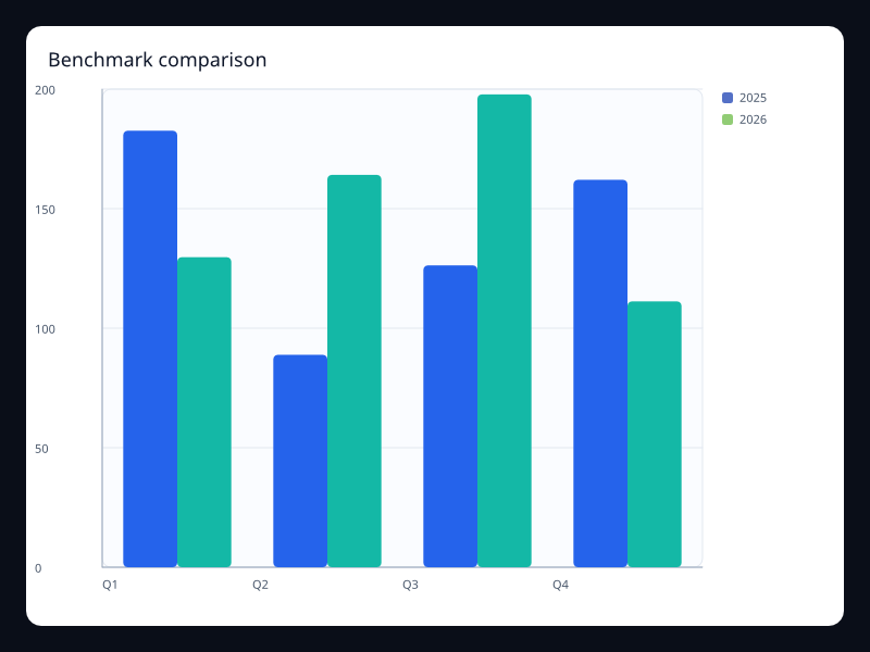
Actual and benchmark values side by side. | Use it when each category needs a direct benchmark. | |
Stacked BarSeries values. | Use it for departmental totals and breakdowns. | |
Signed budget variances on a horizontal axis. | Use it when over and under budget must be symmetric. | |
BarSeries plus maximum axis and background. | Use it for quota and inventory screens. | |
Multiple series stacked per category. | Use it when total and contribution both matter. | |
Vec<f32> aligned to categories. | Use it for short lists and cards. | |
Segment values grouped by period. | Use it to compare segments without splitting the page. | |
Positive and negative BarSeries values. | Use it for sentiment, deltas, and balance views. | |
Values represented by repeated symbols. | Use it when unit counts should feel more tactile than rectangles. | |
Multiple BarSeries on the same categories. | Use it for side-by-side period comparisons. | |
BarSeries with background styling. | Use it for KPI completion panels. | |
BarSeries values crossing zero. | Use it for variance and profit/loss dashboards. | |
Values shown against a visual capacity track. | Use it for scorecards where progress is the dominant signal. | |
PictorialBarSeries values. | Use it for branded but still quantitative category displays. | |
Rounded bars for a compact queue view. | Use it when bars sit inside a polished app surface. | |
Product values stacked into category totals. | Use it for portfolio composition. | |
Positive and negative values on one value axis. | Use it when gains and losses must share one baseline. | |
Sequential deltas that explain a final value. | Use it for financial bridge and variance analysis. | |
BarSeries with horizontal orientation. | Use it for rankings with long labels. | |
Multiple BarSeries. | Use it for region-by-period comparisons. | |
Category/value pairs sorted for comparison. | Use it when exact rank is the product question. | |
Sequential sales and cost changes. | Use it for retail contribution analysis. | |
Category deltas with negative values. | Use it for change analysis around zero. | |
BarSeries with border radius. | Use it when the chart sits in a polished product dashboard. | |
Values against a fixed target background. | Use it when completion against capacity is more important than raw count. | |
Deltas above and below a service baseline. | Use it for operational exception reporting. | |
BarSeries values on a category axis. | Use it in repeated dashboard cards. | |
BarSeries values on a category axis. | Use it when multiple products use the same visual scale. | |
BarSeries with category y-axis. | Use it for top-N views. | |
Multiple BarSeries sharing a stack key. | Use it when totals and composition matter together. | |
Grouped category values across periods. | Use it to compare periods inside each category. | |
Team categories ranked by workload. | Use it when managers need quick capacity comparison. | |
Buckets with counts per age range. | Use it when the reader needs the shape of a queue. | |
BarSeries with background color. | Use it for completion and capacity comparisons. | |
Usage bars with capacity tracks. | Use it for infrastructure and quota dashboards. | |
Delta values over ordered categories. | Use it for profit bridges and cumulative change explanations. | |
Seven ordered weekday values. | Use it when the weekly rhythm is easier as bars than a line. | |
BarSeries with category y-axis. | Use it when labels would collide on the x-axis. |
Choosing within this family
Start with the user's question, not the visual effect. Pick the simplest variant that makes the answer clear, add interaction only when it reduces work for the user, and keep animation purposeful enough that it explains a change rather than decorating the page.
Authoring from a Fission component
Use this reference page as the chart expression inside ordinary Fission component conversion. The chart is a Widget, so it can sit inside a Card, Grid, Scroll, responsive page section, or any other layout container.
use fission::prelude::*;
use fission::charts::{Axis, Chart, LineSeries};

pub struct BarChart;

impl From<BarChart> for Widget {
    fn from(_: BarChart) -> Widget {
        Chart::new()
            .title("Bar")
            .x_axis(Axis::category(vec!["A", "B", "C"]))
            .y_axis(Axis::value())
            .series(vec![LineSeries::new("Series").data(vec![1.0, 2.0, 3.0]).into()])
            .into()
    }
}
Keep expensive data loading outside component conversion. A reducer, job, service, or server route should prepare the typed chart data, then the component should read that state and construct the chart deterministically.
Options, accessibility, and diagnostics
Area | What to decide | How to verify |
|---|---|---|
Data shape | Keep source rows in typed Rust structs, then map them into the series type shown in the example. | Unit test the mapping separately from rendering. |
Options | Choose axes, legends, labels, animation, and interaction based on the user's task. | Add a screenshot test when changing visual behavior. |
Accessibility | Provide a clear title and adjacent summary text for important trends or outliers. | Inspect the generated semantics and make sure the chart is understandable without color alone. |
Failure handling | Render an empty, loading, or error state before constructing the chart if data is unavailable. | Test empty data, partial data, and failed fetches. |
Performance | Prefer summarized or windowed data for very large datasets; keep full raw history in the data layer. | Profile frame time and interaction latency with representative data volumes. |
Previous
Source theme river