
Heatmap
The Heatmap family contains 20 renderer-backed chart variants. Use this page as the entry point for choosing the right variant, then open the variant page for the screenshot, data shape, Rust API notes, and example code.
The chart family is still ordinary Fission UI. Each variant is constructed from typed Rust data, participates in layout and theme decisions, and can be driven by app state, reducers, resources, jobs, or services just like any other widget.
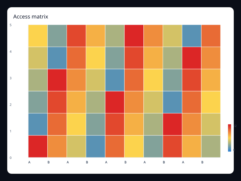
Variants
Chart | Data shape | Use when |
|---|---|---|
Permission-like matrix values. | Use it for dense access and security matrices. | |
Grid values representing availability. | Use it to compare uptime windows. | |
Date/value pairs over a calendar range. | Use it to show daily activity patterns. | |
Grid of pairwise values. | Use it for correlation-like analysis. | |
Date/value pairs for retention events. | Use it to scan day-level consistency. | |
Daily sales values over a date range. | Use it when weekday and date position matter. | |
Dense grid with continuous color scale. | Use it for density and occupancy surfaces. | |
Grid coordinates with numeric intensity. | Use it to find concentration by hour and day. | |
Feature/category values on a two-dimensional grid. | Use it to find usage hotspots. | |
Daily incident counts over a date range. | Use it when the calendar shape carries meaning. | |
Numeric grid values mapped to color. | Use it when color should explain intensity. | |
Daily quality values. | Use it for quality gate consistency over time. | |
Queue depth by queue and time bucket. | Use it for operational queues. | |
Risk values by component and area. | Use it before releases to focus attention. | |
Daily values across a release period. | Use it for calendar-driven delivery views. | |
Resource and time values on a matrix. | Use it for infrastructure saturation. | |
Larger matrix of risk values. | Use it when dense matrix comparison matters. | |
Two-dimensional grid cells with values. | Use it for workload concentration. | |
Date/value activity pairs. | Use it to show consistency and spikes over time. | |
Daily build values with a color scale. | Use it when calendar and intensity both matter. |
Choosing within this family
Start with the user's question, not the visual effect. Pick the simplest variant that makes the answer clear, add interaction only when it reduces work for the user, and keep animation purposeful enough that it explains a change rather than decorating the page.
Authoring from a Fission component
Use this reference page as the chart expression inside ordinary Fission component conversion. The chart is a Widget, so it can sit inside a Card, Grid, Scroll, responsive page section, or any other layout container.
use fission::prelude::*;
use fission::charts::{Axis, Chart, LineSeries};

pub struct HeatmapChart;

impl From<HeatmapChart> for Widget {
    fn from(_: HeatmapChart) -> Widget {
        Chart::new()
            .title("Heatmap")
            .x_axis(Axis::category(vec!["A", "B", "C"]))
            .y_axis(Axis::value())
            .series(vec![LineSeries::new("Series").data(vec![1.0, 2.0, 3.0]).into()])
            .into()
    }
}
Keep expensive data loading outside component conversion. A reducer, job, service, or server route should prepare the typed chart data, then the component should read that state and construct the chart deterministically.
Options, accessibility, and diagnostics
Area | What to decide | How to verify |
|---|---|---|
Data shape | Keep source rows in typed Rust structs, then map them into the series type shown in the example. | Unit test the mapping separately from rendering. |
Options | Choose axes, legends, labels, animation, and interaction based on the user's task. | Add a screenshot test when changing visual behavior. |
Accessibility | Provide a clear title and adjacent summary text for important trends or outliers. | Inspect the generated semantics and make sure the chart is understandable without color alone. |
Failure handling | Render an empty, loading, or error state before constructing the chart if data is unavailable. | Test empty data, partial data, and failed fetches. |
Performance | Prefer summarized or windowed data for very large datasets; keep full raw history in the data layer. | Profile frame time and interaction latency with representative data volumes. |
Previous
Route map
Next
Access matrix