
Line
The Line family contains 36 renderer-backed chart variants. Use this page as the entry point for choosing the right variant, then open the variant page for the screenshot, data shape, Rust API notes, and example code.
The chart family is still ordinary Fission UI. Each variant is constructed from typed Rust data, participates in layout and theme decisions, and can be driven by app state, reducers, resources, jobs, or services just like any other widget.
Variants
Chart | Data shape | Use when |
|---|---|---|
Ordered values with event markers. | Use it when incidents or milestones need to stay attached to the trend. | |
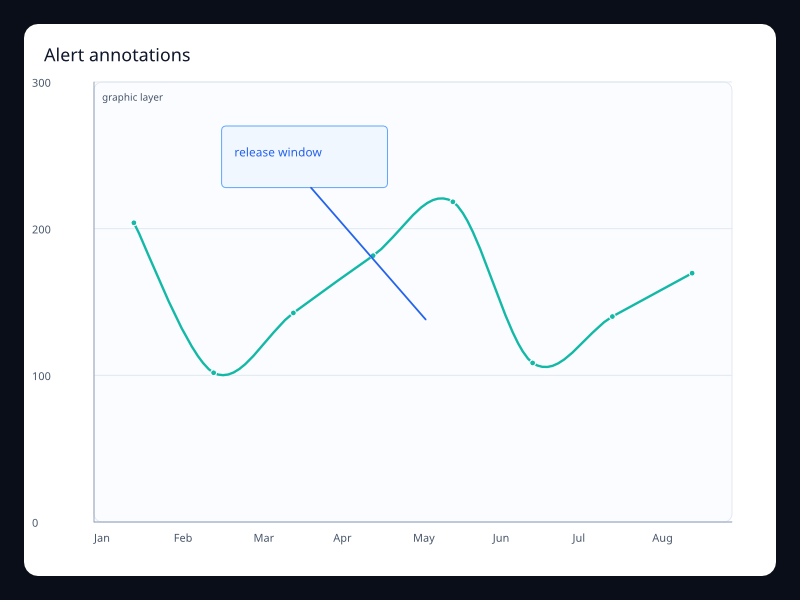
LineSeries plus ChartGraphic. | Use it to explain a visible change directly on the chart. | |
Dense ordered samples from a service counter. | Use it for telemetry panels with many points. | |
Observed values with a highlighted expected range. | Use it when a forecast needs both the line and the safe range. | |
Several ordered series sharing a stack key. | Use it to explain how categories make up a total over time. | |
Compact dense ordered values. | Use it inside dense dashboard cards. | |
Long Vec<f32> on ordered categories. | Use it for monitoring and telemetry surfaces. | |
Trend values with deployment markers. | Use it to connect product changes to metric movement. | |
Two Vec<f32> series on shared axes. | Use it to compare two trends without changing units. | |
Budget percentage samples plus threshold marks. | Use it when teams need to see whether a service is inside its operating band. | |
Vec<f32> plus MarkArea. | Use it when forecasts need uncertainty context. | |
Vec<f32> with area style. | Use it when magnitude and trend should be read together. | |
Discrete samples that update at the end of each interval. | Use it when the value changes after the period closes. | |
LineSeries plus MarkPoint. | Use it to label incidents or releases on a metric. | |
Vec<f32> plus MarkLine and MarkArea. | Use it for service levels, quotas, and alert thresholds. | |
Vec<f32> with nonlinear values. | Use it for adoption curves and saturation effects. | |
Indexed ordered values on a value axis. | Use it when direction and volatility matter more than individual samples. | |
Vec<f32> plus mark lines. | Use it to show expected bounds around a metric. | |
Discrete states represented as stepped values. | Use it for state changes, quotas, or inventory counts. | |
Stacked product series over ordered buckets. | Use it when the total and category mix both matter. | |
Samples with a target and acceptable range. | Use it for production quality metrics with explicit guardrails. | |
Two regional series on shared axes. | Use it when teams compare regions over the same period. | |
Ordered samples with a graphic callout over the plot. | Use it when a chart needs to explain why a trend changed. | |
Long ordered samples with a visible zoom window. | Use it when the primary view should focus on one time range. | |
Ordered samples over a repeated seasonal interval. | Use it when weekly or monthly rhythm is the main signal. | |
Two Vec<f32> series. | Use it when readers need both movement and trend. | |
Vec<f32> over ordered periods. | Use it for seasonal demand and capacity planning. | |
Latency samples over ordered time buckets. | Use it for operations screens that need drift and spikes in one glance. | |
Two ordered series sharing the same axis. | Use it when users need to compare cohorts over the same time range. | |
Multiple LineSeries with one stack key. | Use it for composition over time. | |
Vec<f32> with end step behavior. | Use it when values settle at the end of each interval. | |
Vec<f32> with start step behavior. | Use it when values jump at the start of each interval. | |
Support counts with an area fill. | Use it when volume should be visible at a glance. | |
Raw and smoothed ordered series. | Use it when the user needs the current signal and the trend baseline. | |
Vec<f32> aligned to weekdays. | Use it for operational rhythms and weekly dashboards. | |
LineSeries plus DataZoom. | Use it for long series with local inspection. |
Choosing within this family
Start with the user's question, not the visual effect. Pick the simplest variant that makes the answer clear, add interaction only when it reduces work for the user, and keep animation purposeful enough that it explains a change rather than decorating the page.
Authoring from a Fission component
Use this reference page as the chart expression inside ordinary Fission component conversion. The chart is a Widget, so it can sit inside a Card, Grid, Scroll, responsive page section, or any other layout container.
use fission::prelude::*;
use fission::charts::{Axis, Chart, LineSeries};

pub struct LineChart;

impl From<LineChart> for Widget {
    fn from(_: LineChart) -> Widget {
        Chart::new()
            .title("Line")
            .x_axis(Axis::category(vec!["A", "B", "C"]))
            .y_axis(Axis::value())
            .series(vec![LineSeries::new("Series").data(vec![1.0, 2.0, 3.0]).into()])
            .into()
    }
}
Keep expensive data loading outside component conversion. A reducer, job, service, or server route should prepare the typed chart data, then the component should read that state and construct the chart deterministically.
Options, accessibility, and diagnostics
Area | What to decide | How to verify |
|---|---|---|
Data shape | Keep source rows in typed Rust structs, then map them into the series type shown in the example. | Unit test the mapping separately from rendering. |
Options | Choose axes, legends, labels, animation, and interaction based on the user's task. | Add a screenshot test when changing visual behavior. |
Accessibility | Provide a clear title and adjacent summary text for important trends or outliers. | Inspect the generated semantics and make sure the chart is understandable without color alone. |
Failure handling | Render an empty, loading, or error state before constructing the chart if data is unavailable. | Test empty data, partial data, and failed fetches. |
Performance | Prefer summarized or windowed data for very large datasets; keep full raw history in the data layer. | Profile frame time and interaction latency with representative data volumes. |
Previous
Timeline years